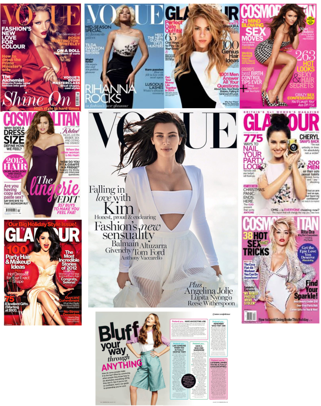
Here is my moodboard of the magazine front covers I like the look of and a double page spread from Cosmopolitan to give an idea of how I like to see articles written.
I chose Vogue magazine front covers as they show elegance, keep within the theme of that particular edition and only have the smallest information needed on the front.
I chose Cosmopolitan magazine front covers as they are colourful, include a wide choice of articles to read from and you know this by seeing the amount of writing on the front cover. It looks a little cramped however, the main image and theme of the magazine makes up for it.
Lastly, I chose Glamour magazine front covers, these are all very similar in style, audience, and content. The main images on the front covers are all direct mode of address. They all make it obvious the main gender to read these magazines are females. The main images are always covering the masthead because the magazines are fully known to their audiences now.
More Research
Magazine: Cosmopolitan
Demographic Profile
Age: 18-24
Gender: Female- 14,551,000 / Male- 2,272,000
Ethnicity: Any
Socio-economic Status: All
Geographical Location: Global
Psychographic Profile
The target audience may be interested in fashion, glamour, make up, celebrities, gossip, health and fitness.
Magazine: Glamour
Demographic Profile
Age: 16-25
Gender: Female- 94% Male: 6%
Ethnicity: Any
Socio-economic Status: All
Geographical Location: Global
Psychographic Profile
The target audience may be interested in fashion, glamour, make up, celebrities and gossip, active with social media.
Magazine: Vogue
Demographic Profile
Age: 18-35
Gender: Female- 87% Male- 13%
Ethnicity: Any
Socio-economic Status: All
Geographical Location: Global
Psychographic Profile
The target audience may be interested in fashion, glamour, make up, celebrities, gossip and beauty.
Interviews
1st double page spread contents:
- How to dress (smart/casual-smart)
- How to do your makeup
2nd double page spread contents:
- How to fight your nerves- tips(bullet points)
- Do’s and don’ts/how to act
- Interview techniques
Interviewing a business owner/manager about interviews:
if they were to interview what would they look for? What would they ask? What would they expect and how do they decide on the best candidate depending on interviews?
Mention what job/business it is and what the role of the interviewer is for e.g. manager, job owner..
Do’s and don’ts: (possible idea)images of someone doing the “do’s and don’ts” For e.g. sitting positions.
Images of what to wear and makeup
“Fighting nerves”-close up shot of someone looking nervous for an interview.
Analysis of Cosmopolitan article:
The layout of the article is in paragraphs, each numbered, giving tips to the reader. The tone of language is informal to connect with the audience of the magazine as well as the direct mode of address. This makes magazine articles more interesting to read as the age group of the magazine audience is appropriate for this. Even though, this is an online article from Cosmopolitan, the language is more or less the same within most articles included in both print and online versions of the magazine.
Analysis of Glamour article:
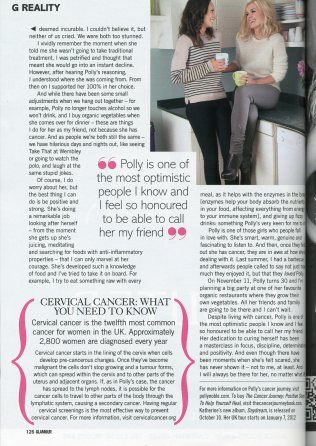
First of all, in the Glamour magazine, the first thing that stands out is the pull quote right in the middle of the page, which grabs the attention of the reader and makes them want to carry on reading if they find the subject interesting. The black and pink theme of the page is related to the article of cervical cancer for this particular page. Due to this article being a story told by a real person, there is a lot to read however, the author has broke the paragraphs up by adding an image relating to the article in the top right corner of the page. In my opinion, the layout could have been more tidy to make it look more professional and possibly the use of more colours.
Analysis of Vogue article:
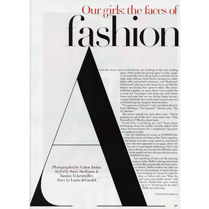
Vogue magazine has always had more text than images on the pages. However, they keep it simple and professional with the theme, font and layout of the text. They put a unique twist to the articles for example on this page, how the text follows the straight line of the ‘A’ that covers most of the page. Vogue makes it obvious that the magazine is more for an audience with the socioeconomic status of ABC1. The reason for this is the price, content and design of the pages within the magazine. With very little colour and images, the magazine pages are still bold and attracts the reader.
